If you’ve ever chosen a paint color from a sample card with complete confidence, only to see it on your wall looking like an entirely different shade, you’re not imagining things, and you’re not alone. In bright, high-elevation places like Denver, CO, paint behaves differently than it does almost anywhere else in the country. Colors can read lighter, sharper, cooler, or more washed out than expected, depending on the time of day, the direction your windows face, and just how much of Denver’s famously intense sunlight is pouring in.
That’s why so many homeowners are caught off guard when their carefully chosen “warm beige” looks stark white on the exterior, or their cozy greige turns oddly cool by early afternoon. Understanding why this happens, and how to choose colors that actually perform in Denver’s light, is one of the most valuable things an experienced painting contractor in Denver can offer before a single drop of paint goes on the wall. It’s also one of the first conversations the team at Dream Painting has with every new client.
Why Paint Colors Behave Differently in Denver
Yes, paint colors absolutely look different in high-altitude, sunny climates, and Denver is one of the clearest examples of this effect in the country.
At over 5,280 feet of elevation, Denver’s atmosphere is thinner and less filtered by humidity or atmospheric haze than lower-elevation cities. The result is sunlight that is more direct, more intense, and more consistent throughout the year than most homeowners account for when choosing paint. Colors that look rich and balanced in a paint store, lit by controlled interior lighting, can shift noticeably once they meet real Denver daylight on your walls.
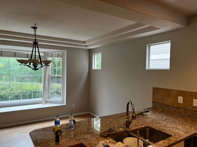
Warm tones may appear softer and less saturated than expected. Cool tones like grays and blues can read sharper, icier, or even slightly harsh. Even well-chosen neutrals can shift between rooms depending on which direction the windows face, south-facing rooms tend to feel brighter and warmer, while north-facing rooms often read cooler and more muted throughout the day.
This is why interior painters in Denver with genuine local experience consistently recommend one thing above all else: test large sample patches directly on your walls, in multiple spots, and observe them at different times of day before committing. A 4×4 inch swatch in a paint store tells you almost nothing about how a color will actually perform in your specific space. Dream Painting builds this testing step into every Project Planning Visit so clients make color decisions with confidence, not guesswork.
Why Denver Homeowners Notice This More Than Most
In Denver neighborhoods like Boulder, Lakewood, and Wash Park, homeowners regularly report painting a room with a color they loved on the chip, only to feel unsettled by it once they’re actually living in the space. The issue is almost never the color itself. It’s the gap between how that color was evaluated and the lighting conditions it’s actually living in.
Long hours of direct sun exposure, large windows common in modern Denver builds, and the clean quality of high-altitude light all amplify this effect. A painting company in Denver that understands these local conditions will routinely recommend slightly warmer undertones than a homeowner might initially gravitate toward, specifically to counterbalance the cooler, sharper quality that Denver daylight introduces.
For residential painting Denver projects involving whole-home color coordination, this knowledge becomes especially important. A palette that feels cohesive under showroom lighting can read as mismatched once natural light reveals the undertones in each shade independently. Getting this right requires local experience, not just general color theory.
What Colors Make a House Look Expensive?
The colors most consistently associated with a high-end, elevated feel are soft, neutral, and intentionally restrained. Warm whites, muted taupes, soft greiges, and deep earthy accents, charcoal, forest green, navy, used selectively create a look that feels curated rather than trendy.
What makes these palettes feel expensive isn’t any single color, it’s the cohesion and consistency of the choices together. A home where wall colors, trim, and exterior tones all feel like they belong to the same family reads as designed. A home where each room or surface was chosen in isolation reads as assembled.
For exterior house painters in Denver, this principle is especially relevant. A home’s curb appeal is shaped more by the relationship between field color, trim, and accent tones than by any one bold choice. Deep body colors with crisp contrasting trim, or soft warm neutrals with a carefully chosen front door accent, consistently outperform single-color exteriors in perceived value.
House painters in Denver who specialize in residential work see this pattern play out constantly, and the homes that photograph best and sell fastest almost always follow a restrained, cohesive palette rather than a bold one.
What Are the Three Colors Not to Paint Your Front Door?
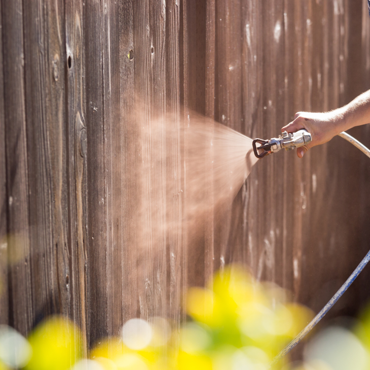
Front door color is one of the highest-impact, lowest-commitment decisions in exterior design, and yet it’s surprisingly easy to get wrong. While personal style always plays a role, experienced exterior house painters in Denver consistently flag three categories of front door colors that tend to undermine curb appeal rather than enhance it.
Colors that disappear into the siding. A front door that is too close in tone to the exterior body color creates no visual anchor. The door, which should be the focal point of the facade, simply blends away. This is a common mistake with pale, low-contrast choices on already-light exteriors.
Extremely bright or neon shades. A vivid, saturated color can work beautifully on some homes in some contexts, but in Denver’s intense sunlight, highly saturated shades often read as harsher and louder than intended. What looks vibrant in lower light can feel overwhelming on a sun-drenched front elevation.
Muddy, low-contrast browns without definition. These shades often feel like an unfinished decision, neither neutral enough to recede nor bold enough to stand out. On brick or stone exteriors especially, they tend to compete awkwardly with natural materials rather than complementing them.
A painting contractor in Denver with exterior experience can evaluate your home’s specific siding color, material, and sun exposure and help you find a front door color that actually works, not just one that looked good on a screen.
What Paint Colors Does Shea McGee Use?
Designer Shea McGee’s signature palette has resonated so widely because it solves the same problem Denver homeowners face every day: how to create spaces that feel warm, layered, and genuinely livable without relying on trends that date quickly.
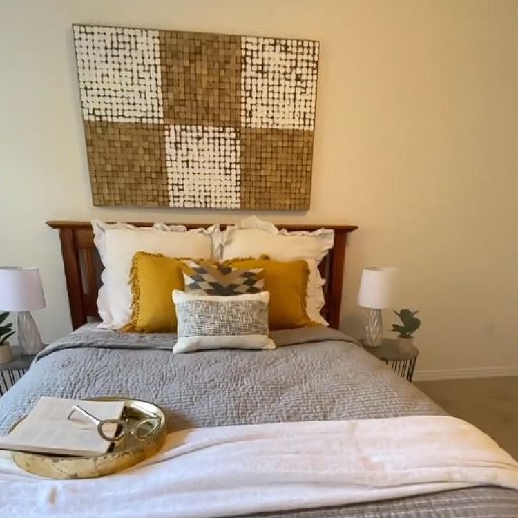
Her color choices lean consistently toward creamy whites, soft warm beiges, muted earthy greens, and gentle contrast rather than stark, cool-toned palettes. The goal is always a space that feels elevated but lived-in, considered without being stiff.
These qualities translate exceptionally well to Denver homes, where cool grays and stark whites can feel clinical under high-altitude light. Interior painters in Denver working in the Shea McGee aesthetic often find that her preferred palette performs better in Colorado’s bright conditions than the cooler neutrals that dominated the previous decade of design. The warmth built into her choices acts as a natural buffer against the sharpening effect of intense sunlight, making rooms feel balanced at 10 a.m. and equally comfortable at 4 p.m.
Dream Painting works with homeowners who are drawn to this design language regularly, helping translate inspiration images into specific paint selections that will actually hold up in their home’s light, not just on a Pinterest board.
What Color Is Replacing Gray?
Cool gray’s reign as the default neutral is ending, and the replacement palette is warmer, softer, and more grounded in natural materials. Across residential painting Denver projects in 2025 and into 2026, the most consistent shift has been away from flat, cool-toned grays toward greige (the warm blend of gray and beige), creamy whites, sandy tones, and muted earthy shades with green or brown undertones.
These colors feel more organic and adaptable, particularly in Denver’s light, where cool grays can tip toward feeling stark or cold rather than clean and modern. The warmer alternatives sit more comfortably under Colorado’s direct sun without washing out or hardening.
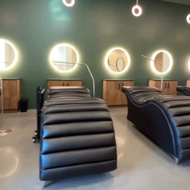
For commercial painting Denver projects, this shift is equally visible. Office interiors, hospitality spaces, and retail environments are moving away from cool minimalism toward palettes that feel more human, more welcoming, and more adaptable to natural light, all qualities that matter even more in high-altitude, high-sun environments like Denver.
A painting company in Denver that stays current with these shifts can help you choose colors that feel fresh today without being so trend-dependent that they feel dated in three years.
Final Thought: In Denver, Light Is Part of the Design
In a city with over 300 days of sunshine a year and air that filters very little of it, paint color is never just about the swatch. It’s about how that color interacts with your specific space, your window orientation, your ceiling height, and the particular quality of light that moves through your home from morning to evening.
The most successful color choices for Denver homes are the ones that stay consistent, warm, and balanced across those changing conditions, chosen with local knowledge, tested in real light, and applied with precision by house painters in Denver who understand the environment they’re working in.
Whether you’re planning an interior refresh with residential painting Denver professionals, updating your home’s exterior with exterior house painters in Denver who know how Colorado sun affects finishes, or refreshing a business space with a commercial painting Denver team, the conversation about color is always worth having before the work begins.
Dream Painting brings that conversation to every project in Denver, CO, because the right color decision made early is the one you’ll still feel good about years from now.
Want Colors That Actually Look Right in Your Home’s Light?
Stop guessing from paint chips. Dream Painting offers free Project Planning Visits for Denver homeowners who want expert, on-site color guidance in their actual space, evaluated in your light, for your walls, before any commitment is made.