Most Denver homeowners spend a lot of time thinking about color. Far fewer think about light, and that’s usually where color decisions go wrong.
Natural light doesn’t just illuminate a paint color. It actively changes it. The same soft gray that looks sophisticated and calm in the morning can shift cooler and flatter by afternoon. A warm white that feels inviting in a south-facing living room might feel washed out in a north-facing hallway. Sunlight brings out undertones you’d never see on a paint chip, intensifies or mutes saturation depending on the hour, and over months and years, it shapes how a color ages on your walls.
Understanding how light interacts with paint isn’t just useful, it’s the difference between a color choice that feels right for a season and one that holds up and continues to look intentional for years. At Dream Painting, our interior painters in Denver factor light exposure into every color recommendation we make. It’s one of the details that separates a thoughtful paint job from a merely competent one.
What Color Should You Paint a Room With Lots of Natural Light?
A sun-filled room is a genuine asset, and the right color choice can make the most of it without tipping into glare, harshness, or visual fatigue.
The key insight: abundant natural light gives you more flexibility, not less. Richer, deeper hues that might feel heavy in a dim space become grounded and sophisticated when natural light keeps them from closing in. Dream Painting’s residential painting team consistently recommends these categories for well-lit rooms:
Soft Neutrals, Beige, Taupe, and Warm Gray These tones stay bright and versatile throughout the day without washing out in strong light. They’re the most forgiving option in rooms where light intensity shifts significantly from morning to afternoon.
Warm Whites and Off-Whites A warm white enhances sunlight without creating glare, the common pitfall of cooler, stark whites, which can feel blinding in direct afternoon sun. For living rooms and open spaces with generous windows, off-whites are consistently one of Dream Painting’s most-recommended finishes.
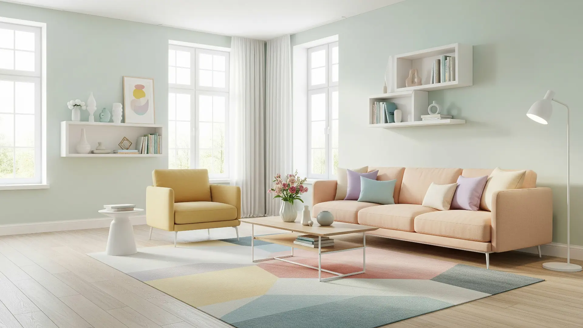
Muted Blues and Greens In naturally lit spaces, soft blue and sage green tones come alive. Natural light reveals their depth and prevents them from reading as flat or cold, making them ideal for living areas where you want a sense of calm sophistication.
One practice Dream Painting’s house painters in Denver always emphasize: test paint samples on the actual wall, at multiple times of day. Natural light reveals undertones that simply don’t show up under artificial light or on a paint chip, and what you see at 10 a.m. in a Colorado summer morning is not what you’ll see at 3 p.m. in November.
What Are The Drawbacks to Natural Light?
Natural light is an asset, but it’s also a force your paint has to contend with over time. Understanding its less flattering effects helps you choose colors and finishes that age gracefully rather than looking tired within a few years.
Fading Bright, saturated colors are most vulnerable. UV exposure gradually strips vibrancy from bold hues, reds, deep blues, and vivid greens, leaving them looking dull and washed out long before the paint physically wears down. This is one reason Dream Painting’s painting company in Denver tends to steer clients toward muted, timeless tones in rooms with strong sun exposure. They fade more slowly and more gracefully.
Yellowing Whites and warm neutrals can shift toward yellow over time, particularly in rooms that receive intense afternoon sun. High-quality, lightfast paint formulas resist this significantly better than budget options, a real-world durability difference that becomes visible within a few years.
Glare and Contrast Issues Glossy and semi-gloss finishes reflect light at sharp angles, which can make sun-drenched rooms feel harsh and uncomfortable. For most naturally lit living rooms and hallways, Dream Painting’s interior painters in Denver recommend a matte or eggshell finish, enough sheen to be cleanable, without the reflective intensity that causes visual fatigue.
The practical fix for all three: invest in premium, lightfast paint formulas and choose finishes matched to the room’s light exposure. It’s a decision that pays off in how the color looks five years from now, not just five days after application.
What Colors Make a Room Look Expensive?
There’s a quality that some rooms have, a sense of refinement and intention, that doesn’t require high-end furnishings to achieve. Much of it comes down to paint color and finish. The shades that most consistently read as sophisticated and elevated, especially in naturally lit spaces, are:
Deep Grays and Charcoals Paired with crisp white trim, a deep gray wall carries an effortless, high-end quality. Natural light keeps it from feeling heavy, and the contrast with white trim delivers the kind of sharp, architectural clarity that photographs beautifully and impresses in person.
Soft, Muted Blues and Greens These tones convey calm elegance in a way that feels curated rather than trendy. Dusty blue, soft sage, and muted teal have been go-to choices for upscale residential spaces for years, and show no signs of dating.
Warm Taupes and Earthy Beiges A quality warm taupe creates a luxurious backdrop that makes furniture look intentional and spaces feel considered. In Denver homes with wood floors and natural stone accents, these tones integrate seamlessly with the existing environment rather than competing with it.
Finish is equally important. Matte and eggshell paints look more refined than flat or high-gloss options in naturally lit rooms, the subtle depth of these finishes reads as quality in a way that flat paint simply doesn’t achieve. Dream Painting’s residential painting team helps clients identify the right finish for each surface and light condition, ensuring the final result looks as considered as the color itself.
Should the Hallway Be the Same Color as the Living Room?
This is one of the most common questions Dream Painting’s painting contractor in Denver team fields, and the honest answer is: it depends on what you’re trying to achieve.
For a cohesive, flowing feel across connected spaces, matching hallway and living room colors works well, particularly in open-plan layouts where the visual boundary between spaces is already soft. The continuity creates a sense of intentional design rather than room-by-room decision-making.
However, in most homes, a slightly lighter or more neutral tone in the hallway is the more practical and visually effective choice. Hallways often receive less natural light than adjacent living rooms, and a color that looks balanced in a bright, open space can feel heavier or more closed-in when moved into a narrower corridor. A subtle step lighter maintains visual continuity while compensating for the difference in light.
The other option, deliberate contrast, can work beautifully when handled with care. A slightly deeper, warmer hallway tone against a lighter living room creates a sense of transition and arrival that makes both spaces feel more purposeful. Dream Painting’s house painters in Denver can help you evaluate which approach suits your specific layout, light conditions, and existing finishes.
Making the Most of Your Home’s Natural Light
Whether you’re refreshing a sun-drenched living room, rethinking a dim hallway, or trying to choose colors that hold up under Colorado’s intense UV over the long term, Dream Painting brings the expertise to get it right. As a trusted painting contractor in Denver with deep experience in both residential and commercial painting, our team considers light exposure, finish selection, and product quality as carefully as color choice itself.
The result is paint work that doesn’t just look good on the day we finish, it continues to perform, age gracefully, and feel right in your home for years to come. Whether you need experienced interior painters in Denver for a room-by-room refresh, skilled exterior house painters in Denver to protect and beautify your home’s facade, or a reliable painting company in Denver for a larger residential or commercial project, Dream Painting delivers results built to last in Denver’s unique environment.
Contact Dream Painting today for a free consultation, and let’s choose colors that work with your home’s light, not against it.